

 آخرین مطالب
 ورژن دوم افکت هولوگرافیک و شب رنگ برای کارت ها Pokemon Card Holo Effect v2
 مطالب پربازدید
 دکمه با خط حاشیه گردنیت رنگی و متحرک Button Border Animation

 ۴۵
۴۵

... Loading
![Post Pic]()
... Loading
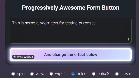
این کد یک دکمه تعاملی ایجاد میکند که با استفاده از جاوا اسکریپت به تعداد کلمات وارد شده در یک فیلد متنی واکنش نشان میدهد. دکمه بسته به تعداد کلمات، فعال یا غیرفعال میشود و کلاسهای CSS مختلفی را اعمال میکند. همچنین، کاربران میتوانند اثرات مختلفی را با استفاده از دکمههای رادیویی انتخاب کنند که این اثرات به دکمه اعمال میشود. این کد با استفاده از ویژگیهای سفارشی CSS کار میکند و به دلیل محدودیتهای مرورگر، فقط در مرورگرهای مبتنی بر کرومیوم قابل اجرا است. در این کد جاوا اسکریپت برای قسمت متن و عملکرد دکمه های رادیویی بکار رفته و افکت ها با سی اس اس هستند. شماره کد: 5
منبع کدHTML
Progressively Awesome Form Button
Made by Simey
CSS
:root {
--shimmer-hue-1: 213deg;
--shimmer-sat-1: 95%;
--shimmer-lit-1: 91%;
--shimmer-hue-2: 248deg;
--shimmer-sat-2: 100%;
--shimmer-lit-2: 86%;
--shimmer-hue-3: 293deg;
--shimmer-sat-3: 78%;
--shimmer-lit-3: 89%;
--glow-hue: 222deg;
--shadow-hue: 180deg;
--spring-easing: linear(
0, 0.002, 0.01 0.9%, 0.038 1.8%, 0.156, 0.312 5.8%, 0.789 11.1%, 1.015 14.2%,
1.096, 1.157, 1.199, 1.224 20.3%, 1.231, 1.231, 1.226, 1.214 24.6%,
1.176 26.9%, 1.057 32.6%, 1.007 35.5%, 0.984, 0.968, 0.956, 0.949 42%,
0.946 44.1%, 0.95 46.5%, 0.998 57.2%, 1.007, 1.011 63.3%, 1.012 68.3%,
0.998 84%, 1
);
--spring-duration: 1.33s;
}
@property --mask {
syntax: "";
inherits: false;
initial-value: 33deg;
}
@keyframes spin {
0% {
--mask: 0deg;
}
100% {
--mask: 360deg;
}
}
@keyframes wipe {
0% {
mask-position: 200% center;
}
100% {
mask-position: 0% center;
}
}
@keyframes pulse {
0%, 90%, 100% {
opacity: 0;
}
20% {
opacity: 1;
}
}
@keyframes pulse2 {
0% {
opacity: 0;
}
8% {
opacity: 1;
}
14% {
opacity: 0;
}
20% {
opacity: 1;
}
100% {
opacity: 0;
}
}
@keyframes flicker {
0% { opacity:0.1; mask-image:none;}
1% { opacity:1; }
2% { opacity:0.5; }
3% { opacity:0.1; }
4% { opacity:0.7; }
5% { opacity:1; }
7% { opacity:0.7;
mask-image: linear-gradient(
90deg, transparent 15%, black 45%, black 55%, transparent 85%
); }
8% { opacity:0.1; }
10% { opacity:0.4; }
13% { opacity:1; }
15% { opacity:0.1;
mask-image: linear-gradient(
45deg, rgba(0,0,0,0.4) 25%, transparent 45%, black 65%, black 90%, transparent 100%
);}
17% { opacity:0.8;}
19% { opacity:0.3; }
21.5% { opacity:0; }
23% { opacity:1; }
39% { opacity:0.7; }
45% { opacity:0.2; }
49% { opacity:0.9; }
52% { opacity:0.7;}
53.5% { opacity:0.2;
mask-image: linear-gradient(
90deg, black 15%, black 45%, rgba(0,0,0,0.4) 75%, transparent 85%
);}
57% { opacity:0.8; }
63% { opacity:1; }
75% { opacity:.85; }
77% { opacity:1; }
80% { opacity:.9; }
82% { opacity:.95; }
83% { opacity:.85; }
86% { opacity:1; }
89% { opacity:.85; }
91% { opacity:1; }
92% { opacity:.9; }
100% { opacity:1; }
}
@keyframes shine {
0% {
opacity: 0;
}
15% {
opacity: 1;
}
55% {
opacity: 1;
}
100% {
opacity: 0;
}
}
@keyframes text {
0% {
background-position: 100% center;
}
100% {
background-position: -100% center;
}
}
button {
width: 100%;
color: var(--bg);
font-weight: 600;
background-image: linear-gradient(
315deg,
hsl(var(--shimmer-hue-1),var(--shimmer-sat-1),var(--shimmer-lit-1)) 0.00%,
hsl(var(--shimmer-hue-2),var(--shimmer-sat-2),var(--shimmer-lit-2)) 47%,
hsl(var(--shimmer-hue-3),var(--shimmer-sat-3),var(--shimmer-lit-3)) 100.00%
);
padding: .8em 1.4em;
position: relative;
isolation: isolate;
box-shadow: 0 2px 3px 1px hsl(var(--glow-hue) 50% 20% / 50%);
border-radius: 0.66em;
scale: 1;
transition: all var(--spring-duration) var(--spring-easing);
}
.shimmer {
position: absolute;
inset: -40px;
border-radius: inherit;
mix-blend-mode: color-dodge;
mix-blend-mode: plus-lighter;
pointer-events: none;
}
.shimmer::before,
.shimmer::after {
transition: all 0.5s ease;
opacity: 0;
content: "";
border-radius: inherit;
position: absolute;
inset: 40px;
}
.shimmer::before {
box-shadow: 0 0 3px 2px hsl(var(--shimmer-hue-1) 20% 95%),
0 0 7px 4px hsl(var(--shimmer-hue-1) 20% 80%),
0 0 13px 8px hsl(var(--shimmer-hue-2) 40% 60%),
0 0 22px 6px hsl(var(--shimmer-hue-2) 20% 40%);
z-index: -1;
}
.shimmer::after {
box-shadow: inset 0 0 0 1px hsl(var(--shimmer-hue-2) 70% 95%),
inset 0 0 3px 1px hsl(var(--shimmer-hue-2) 100% 80%),
inset 0 0 9px 1px hsl(var(--shimmer-hue-2) 100% 70%);
z-index: 2;
}
button .text {
color: transparent;
background-clip: text;
background-color: var(--bg);
background-image: linear-gradient(120deg, transparent, hsla(var(--shimmer-hue-1),100%,80%,0.66) 40%, hsla(var(--shimmer-hue-2),100%,90%,.9) 50%, transparent 52%);
background-repeat: no-repeat;
background-size: 300% 300%;
background-position: center 200%;
}
button:not([disabled]).textShine .text {
animation: text 1s ease-in 1;
}
button:not([disabled]).level0 {
background-color: rgb(216, 217, 235);
background-image: none;
}
button:not([disabled]).level1 .shimmer::before,
button:not([disabled]).level1 .shimmer::after {
animation: shine 2s ease-in 1;
}
button:not([disabled]).level2 .shimmer::before,
button:not([disabled]).level2 .shimmer::after {
opacity: 1;
}
button:not([disabled]).level2 .shimmer {
mask-image: conic-gradient(
from var(--mask, 0deg),
transparent 0%,
transparent 10%,
black 36%,
black 45%,
transparent 50%,
transparent 60%,
black 85%,
black 95%,
transparent 100%
);
mask-size: cover;
animation: spin 3s linear infinite both -0.5s;
}
button:not([disabled]).level2[data-effect=wipe] .shimmer {
mask-image: linear-gradient(
90deg, transparent 20%, black 88%, transparent 90%
);
mask-size: 200% 200%;
mask-position: center;
animation: wipe 1.5s linear infinite both -0.5s;
}
button:not([disabled]).level2[data-effect=wipe2] .shimmer {
mask-image: linear-gradient(
90deg, transparent 15%, black 45%, black 55%, transparent 85%
);
mask-size: 200% 200%;
mask-position: center;
animation: wipe 3s linear infinite both -0.5s;
}
button:not([disabled]).level2[data-effect=pulse] .shimmer {
mask-image: none;
animation: pulse 3s ease infinite both  -0.5s;
}
button:not([disabled]).level2[data-effect=pulse2] .shimmer {
mask-image: none;
animation: pulse2 3s ease infinite both  -0.5s;
}
button:not([disabled]).level2[data-effect=flicker] .shimmer {
mask-image: none;
animation: flicker 3.33s ease infinite both  -0.5s;
}
button[disabled] {
background: rgb(76 76 92);
background-image: none;
}
button:hover:not(:active):not([disabled]).level1,
button:hover:not(:active):not([disabled]).level2 {
scale: 1.1;
transition-duration: calc(var(--spring-duration)*0.5);
}
button:active:not([disabled]).level1,
button:active:not([disabled]).level2  {
scale: 1.05;
transition-duration: calc(var(--spring-duration)*0.5);
}
button:hover.level2 .shimmer {
animation-play-state: paused!important;
mask-image: none!important;
}
button:hover:not([disabled]) .shimmer::before,
button:hover:not([disabled]) .shimmer::after,
button.active .shimmer::before,
button.active .shimmer::after {
opacity: 0.75;
}
JS
// inspired by Aaron Iker
// https://codepen.io/aaroniker/pen/PoOvoaY
// and Adam Argyle
// https://codepen.io/argyleink/details/abPvZJo
// uses custom properties, so will only work in Chromium Browsers.
let levels = [1, 4, 7];
let btn = document.querySelector("button");
let radios = document.querySelectorAll("[type=radio]");
let count = document.querySelector(".count");
let t = document.querySelector("textarea");
let previousWords = wordCount(t.value);
let previousLevel = 0;
let deltaUp = false;
count.innerHTML = levels.at(-1) + 1 -  wordCount(t.value);
function wordCount(str) {
return str.trim().split(" ").length;
}
t.oninput = (e) => {
const str = t.value;
const words = wordCount(str);
let level = 0;
count.innerHTML = Math.max(levels.at(-1) + 1 - words,0);
btn.classList.add("disabled");
btn.classList.remove("level0");
btn.classList.remove("level1");
btn.classList.remove("level2");
btn.setAttribute("disabled", true);
addShine = () => {
if (previousLevel < level) {
btn.classList.remove("textShine");
window.requestAnimationFrame(() => {
btn.classList.add("textShine");
previousLevel = level;
});
} else {
previousLevel = level;
}
}
if (words > levels[2]) {
level = 3;
btn.removeAttribute("disabled");
btn.classList.remove("disabled");
btn.classList.remove("level0");
btn.classList.remove("level1");
btn.classList.add("level2");
addShine()
} else if (words > levels[1]) {
level = 2;
btn.removeAttribute("disabled");
btn.classList.remove("disabled");
btn.classList.remove("level0");
btn.classList.add("level1");
addShine()
} else if (words > levels[0]) {
level = 1;
btn.removeAttribute("disabled");
btn.classList.remove("disabled");
btn.classList.add("level0");
addShine()
} else {
level = 0;
btn.setAttribute("disabled", true);
btn.classList.add("disabled");
previousLevel = level;
}
previousWords = words;
};
radios.forEach((r) => {
r.onchange = (e) => {
btn.dataset.effect = e.currentTarget.value;
};
if( r.checked ) {
btn.dataset.effect = r.value;
}
});HTML
37
CSS
272
JS
75


 Category:
 Form Button Hover Radio
 Tags:
Tags: Hover Button Effect Wipe Effect CSS prisoner849@ استایل دکمه افکت هاور دکمه ساخت فرم اچ تی ام ال
 Author:
 newuiux
 Date:
Date: جمعه, ۵ مرداد ۱۴۰۳
 Number:

 لیست برخی تگ های این سایت: