

 آخرین مطالب
 ورژن دوم افکت هولوگرافیک و شب رنگ برای کارت ها Pokemon Card Holo Effect v2
 مطالب پربازدید
 دکمه با خط حاشیه گردنیت رنگی و متحرک Button Border Animation

 ۱۲۰
۱۲۰

... Loading
![Post Pic]()
... Loading
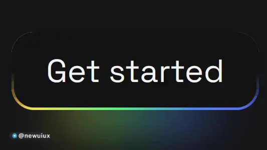
یک دکمه زیبا که فقط با سی اس اس بدون جاوا اسکریپت ساخته شده و یک خط حاشیه (Border) بصورت گردنیت متحرک دارد و هنگام Hover روی دکمه سرعت تغییر رنگ و Blur بیشتر میشود. شماره کد: 2
منبع کدHTML
CSS
@import url('https://fonts.googleapis.com/css?family=Space%20Grotesk:700|Space%20Grotesk:400');
:root {
/*  change this for scaling  */
--m: 4rem;
--red: #FF6565;
--pink: #FF64F9;
--purple: #6B5FFF;
--blue: #4D8AFF;
--green: #5BFF89;
--yellow: #FFEE55;
--orange: #FF6D1B;
}
body {
background-color: #141516;
display: flex;
flex-direction: column;
justify-content: center;
align-items: center;
height: 100vh;
margin: 0;
}
button {
border: calc(0.08 * var(--m)) solid transparent;
position: relative;
color: #F3F3F3;
font-family: 'Space Grotesk';
font-size: var(--m);
border-radius: calc(0.7 * var(--m));
padding: calc(0.5 * var(--m)) calc(1 * var(--m));
display: flex;
justify-content: center;
cursor: pointer;
background:linear-gradient(#121213, #121213), linear-gradient(#121213 50%, rgba(18, 18, 19, 0.6) 80%, rgba(18, 18, 19, 0)),  linear-gradient(90deg, var(--orange), var(--yellow), var(--green), var(--blue), var(--purple), var(--pink), var(--red));
background-origin: border-box;
background-clip: padding-box, border-box, border-box;
background-size: 200%;
animation: animate 2s infinite linear;
}
button::before {
content: '';
background: linear-gradient(90deg, var(--orange), var(--yellow), var(--green), var(--blue), var(--purple), var(--pink), var(--red));
height: 30%;
width: 60%;
position: absolute;
bottom: -20%;
z-index: -5;
background-size: 200%;
animation: animate 2s infinite linear;
filter: blur(calc(0.8 * var(--m)));
}
button:hover, button:hover::before {
animation: animate 0.5s infinite linear;
}
@keyframes animate {
0% {background-position: 0}
100% {background-position: 200%}
}
@media screen and (max-width: 1000px) {
:root {
--m: 2rem;
}
}
JS
No js ...HTML
1
CSS
62
JS
0


 Category:
 Background Body Button Hover Only by CSS
 Tags:
Tags: Border CSS Animation Juxtopposed@ No JS دکمه فقط با سی اس اس
 Author:
 newuiux
 Date:
Date: دوشنبه, ۱ مرداد ۱۴۰۳
 Number:

 لیست برخی تگ های این سایت: